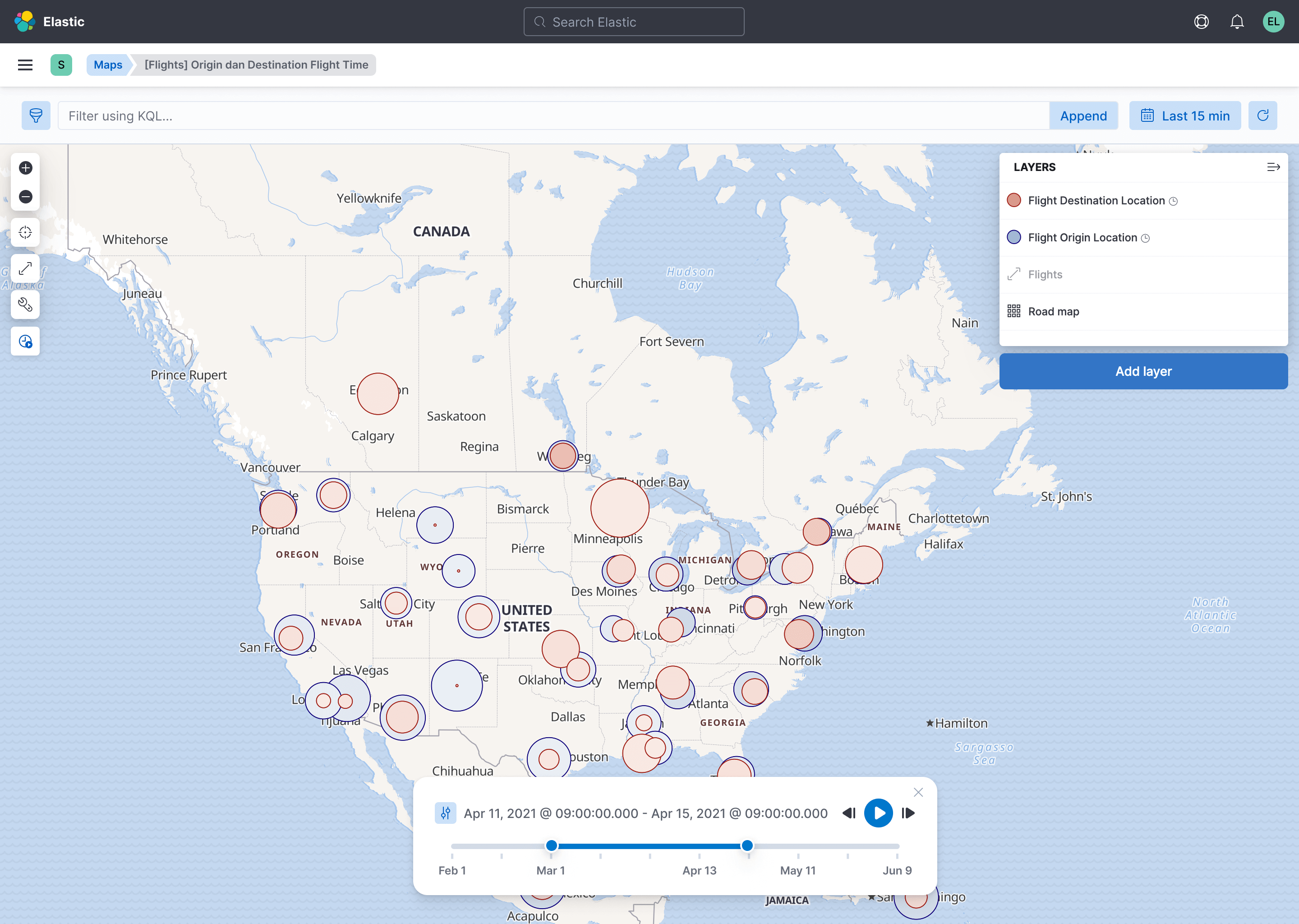
A timeslider for Elastic Maps
August 10, 2021 • 5 min read
During my time as the primary designer for for Elastic Maps, I had the opportunity to design a feature that had been eagerly anticipated by the GIS community - the Timeslider. Elastic Maps is an application that is part of Kibana. Kibana, in essence, is an open-source data visualization and exploration tool designed to work seamlessly with Elasticsearch, another powerful open-source tool for searching and analyzing data.
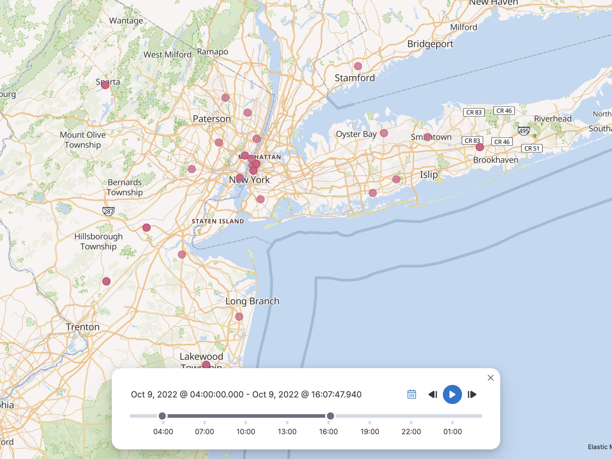
Elastic Maps, as a component of Kibana, facilitates the visual representation and interaction with geospatial data, making it a valuable asset for a wide range of users, including those in the GIS community. The Timeslider, a feature within Elastic Maps, significantly improved the exploration and playback of geospatial data, enhancing the mapping experience by adding an interactive element that had long been in demand.
Monitoring Progress with Milestones
To ensure the project's success, we established clear milestones:
Milestone 1: Introduction of the Timeslider
- Enable the Timeslider in the Maps app, with a default "off" setting.
- Synchronize time representation on the map with the selection made in the Time Picker.
- Ensure that the time window always remains shorter in duration than the selected time extent.
- Implement manual navigation through time increments in both backward and forward directions.

Milestone 2: Empowering Customization
- Allow users to customize the duration of the time window by manipulating the start and end points.
- Enhance the Timeslider's versatility by enabling users to drag the time window to navigate through steps.
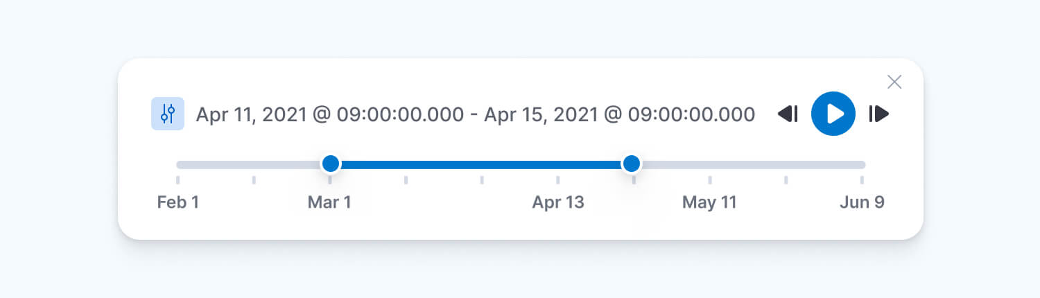
Milestone 3: Introduction of Playability Features
- Introduce a Play button for continuous playback without requiring manual steps. Include the ability to pause the playback.
- Enable looping of the playback and provide a transparent history view for a specified number of previous steps.
- Offer a range of playback speed settings, including slow, moderate, and fast.
- Implement a visible time-range display to improve the user experience during playback.
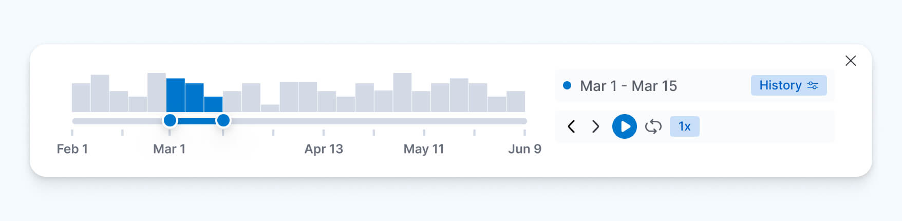
Milestone 4: Data Insights with a Histogram
- Introduce a histogram feature to provide insights into data distribution over time.
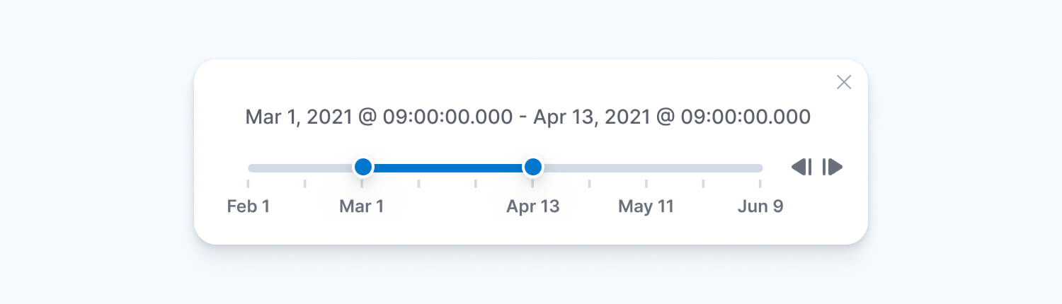
Finding the Right Spot for the Timeslider and Crafting the Prototype
When it came to deciding where the Timeslider should go, we had some initial ideas. Initially, we considered putting it close to the global time picker, but we soon realized that this might create some issues. The global time picker is used in multiple Kibana apps, so we were worried that adding the Timeslider there might cause unexpected problems. To play it safe and avoid any hiccups, we decided to start by adding the Timeslider to the map toolbar. This way, we could see how it worked out and make sure it didn't disrupt things for our users.
At the same time, we wanted to make sure our design was user-friendly and effective. That's when we decided to conduct usability testing to get valuable feedback from real users. To make sure our prototype was just right, we carefully built it using Figma. The actual code for the Timeslider was created using React.
This way, we made sure the Timeslider not only looked good but also worked well and was easy for users to interact with.
Usability Testing: Valuable Insights and Refinements
Three usability testing sessions with external users focused on evaluating the Timeslider within the Maps app. Key findings included:
- Users initially searched for the Timeslider within the global time picker UI but were able to locate it within a minute.
- Customizing the time slice to precisely 30 seconds proved to be slightly challenging for users.
- Users anticipated the ability to drag the time window from the middle to reveal the most recent 30 seconds, an aspect that was not initially implemented.
- Navigation through time using the Timeslider was a bit confusing, especially in terms of the circular motion of the slider.
- Adjusting the full time extent to reflect the last 24 hours was easily accomplished by users through the global time picker.
In response to this valuable feedback, several improvements were made, including:
- The addition of a histogram to provide insights into data distribution over time.
- Enhancement of the range slider for a more intuitive user experience.
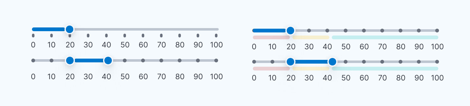
Visual representations of these improvements were as follows:
Before:
After:
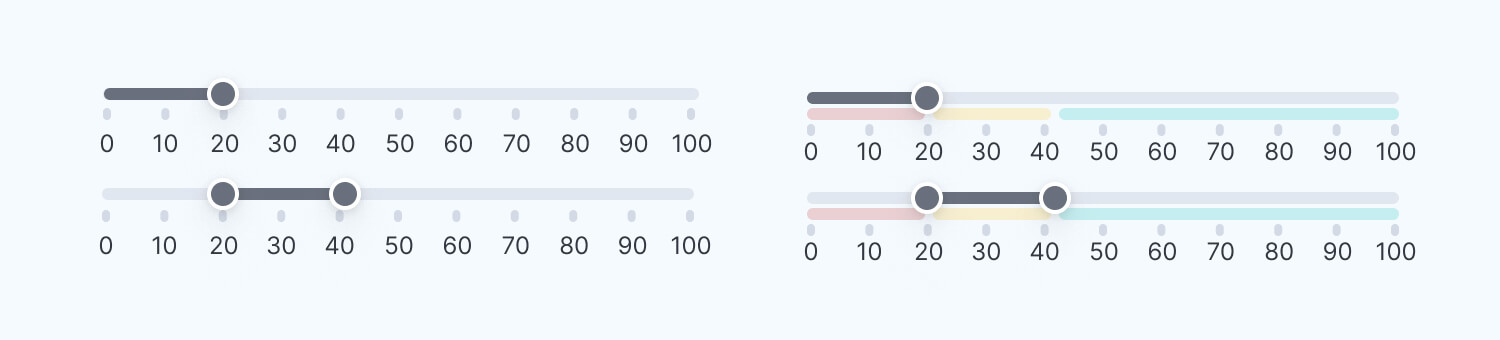
Additionally, icons were incorporated to complement the improved range sliders:

Challenges and Teamwork
Challenges often shape the path to innovation, and in my journey with the Timeslider, one of the key challenges I encountered was dealing with data. To make the Timeslider truly effective, I had to consider multiple scenarios in which the data could be used. It was essential to ensure that our design not only met current needs but also allowed for future scalability. Fortunately, I wasn't alone in this endeavor. My colleagues played a crucial role in helping me address these challenges. They provided valuable data sets and collaborated closely to test the functionality and usability of the Timeslider in various data-rich scenarios. Their support and contributions were instrumental in making the Timeslider a robust and versatile tool for our users.
The Culmination
To witness the final outcome of our journey, you can view a video showcasing the Timeslider in action:
With the introduction of the Timeslider and its various enhancements, Elastic Maps was better equipped to meet the diverse needs of the GIS community. This dynamic tool not only empowered users to explore geospatial data more effectively but also added an engaging layer of interactivity to the mapping experience. Our innovative journey has concluded, and the results are now evident.